Brand · Food & agriculture · 2026
Hektar
One farm. Four hundred families. Zero middlemen.
- Brand identity
- Packaging
- Local marketing
The concept
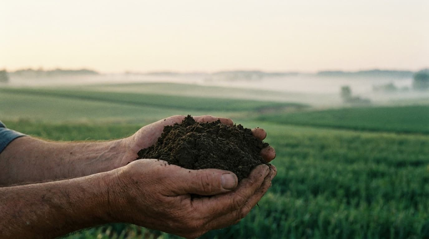
Hektar is a regenerative farm outside Tirana converting from wholesale vegetables to a direct community model: weekly harvest boxes, an on-farm shop day, and standing orders for six restaurants. The brand turns soil practice into shelf language — every box states the parcel it came from and what that hectare is doing next season. Revenue: subscriptions, farm-day retail, restaurant contracts.
Who it’s for
Urban families within 40 minutes of the farm, plus chefs who want provenance they can name.
- 400
- Weekly boxes at capacity
- 6
- Restaurant standing orders
- 12
- Parcels with their own stories
Brand direction
Agricultural modernism: seed-catalogue typography, field-map geometry, and a palette lifted from chard, soil and squash. The grid motif is literal — the farm's parcel map becomes the identity system, with each hectare numbered and color-coded across packaging, signage and the harvest email.
Visual identity
Field Cream
#eef0e2
Canvas
Chard Green
#3e6b2f
Accent
Topsoil
#26331f
Type
Squash
#c96f2c
Seasonal pop
Display type
Hektar
Sentient — sturdy serif with seed-catalogue warmth
Text + system
General Sans — labels, tables, box slips
Parcel numbers (H-01…H-12) are set like map coordinates and double as product SKUs.
Voice
A farmer who keeps good records: concrete, seasonal, never precious.
REF · Agricultural modernism — field-map geometry, seed-catalogue serif, chard-and-soil palette.
Homepage & product interface
Screen 01 · Field journalCampaign system
Screen 02 · Local launch campaignMarketing angle
Radical specificity beats organic clichés: never say 'fresh and local', say 'Parcel H-07, picked 06:40, forty-one worm casts per square metre.'
The campaign
"Meet Your Hectare" — a 6-week local push: parcel-coded posters at markets and schools, WhatsApp broadcast for box subscribers with the week's parcel story, and a first-Saturday farm day where families walk the exact rows their box came from. Restaurants get parcel cards for their menus.
Headline directions
“This chard has an address.”
“Subscribe to a hectare, not a supermarket.”
“Saturday: walk the rows your dinner grew in.”
What Limited Labs built
- 01Full identity: parcel-map mark, H-series numbering, seed-catalogue type system
- 02Packaging suite: box slips, parcel cards, market signage
- 03Field Journal editorial format powering provenance content
- 04Local campaign system: posters, WhatsApp cadence, farm-day playbook
- 05Restaurant partnership kit with menu provenance cards
Service demonstrated
Brand
Brand identity systems — an identity that is also an operating system: the parcel grid organizes packaging, content, and sales channels alike.
Explore this serviceWork 04 of 25
Want a system like this for your business?
Every work in this collection is one connected build — brand, product, and marketing designed together. That’s the whole idea behind Limited Labs.