Software · Health · 2026
Salus
Healthcare that feels like it was designed for humans.
- Product design
- Booking systems
- Brand identity
The concept
Salus is a patient-experience layer for private clinics and specialist practices whose care is excellent but whose booking, intake and follow-up feel like 2009. It replaces the phone-and-paper intake with a calm mobile flow: book, complete history at home, arrive to a prepared clinician, and receive a plain-language after-visit summary. Revenue: per-provider SaaS plus a patient-facing premium care-plan tier.
Who it’s for
Private clinics, dental groups and specialist practices that compete on experience, not just outcomes.
- -40%
- Target no-show rate
- <60s
- Booking-to-confirmed
- +★
- Reviews as a growth loop
Brand direction
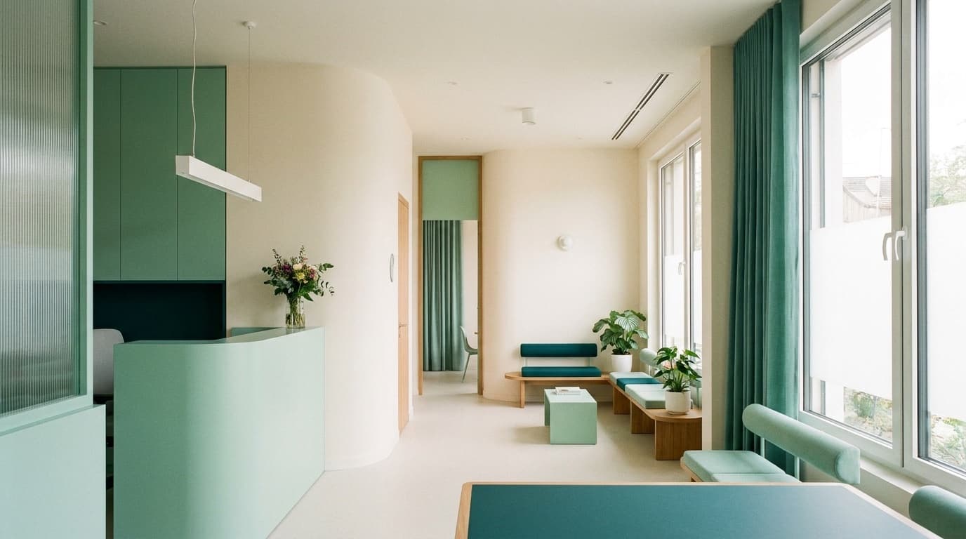
Spa-grade clinical calm. Soft daylight whites, mint and deep teal, rounded geometry, and a friendly humanist face. It deliberately rejects both sterile hospital blue and startup neon — it feels like a well-lit waiting room you don't mind sitting in. Lots of air; nothing shouts.
Visual identity
Sea Glass
#eef4f2
Canvas
Deep Teal
#12857a
Accent
Pine Ink
#183a37
Type
Mint
#7fd1c3
Highlight
Display type
Salus
Chillax — soft, rounded, reassuring
Text + system
General Sans — clinical clarity for forms
Medical language is always paired with a plain-language line set slightly larger than the clinical term.
Voice
A great nurse: warm, plain-spoken, never patronizing. Explains before it asks.
REF · Calm clinical design — soft daylight, mint/teal, generous whitespace — One Medical × Oura.
Product · mobile
Screen 01 · Patient bookingClient portal
Screen 02 · Patient care portalMarketing angle
Compete on the 90% of care that isn't the appointment: the booking, the waiting, the not-knowing. Salus makes a good clinic feel great before and after the ten minutes with the doctor.
The campaign
"The Ten Good Minutes" — a trust campaign built around one insight: patients judge a clinic on everything around the visit. Testimonial-led social plus a clinic-facing ROI story (no-shows down, reviews up). Waiting-room QR posters convert existing patients to the app.
Headline directions
“Great care shouldn't start with a busy phone line.”
“Arrive prepared. Leave understood.”
“The ten minutes are the doctor's. We fixed the other ninety.”
What Limited Labs built
- 01Patient-experience product: booking, at-home intake, care portal
- 02Mobile-first booking and plain-language after-visit summaries
- 03Care-plan tracker with reminders and photo check-ins
- 04Calm clinical brand identity and voice system
- 05'The Ten Good Minutes' trust campaign and review engine
Service demonstrated
Software
Product design for regulated, human-critical services — reducing anxiety through interface calm, clarity, and thoughtful flows.
Explore this serviceWork 08 of 25
Want a system like this for your business?
Every work in this collection is one connected build — brand, product, and marketing designed together. That’s the whole idea behind Limited Labs.