Experience · Travel · 2026
Meridian
Small expeditions to the edges of the map.
- Brand identity
- Interactive web
- Marketing
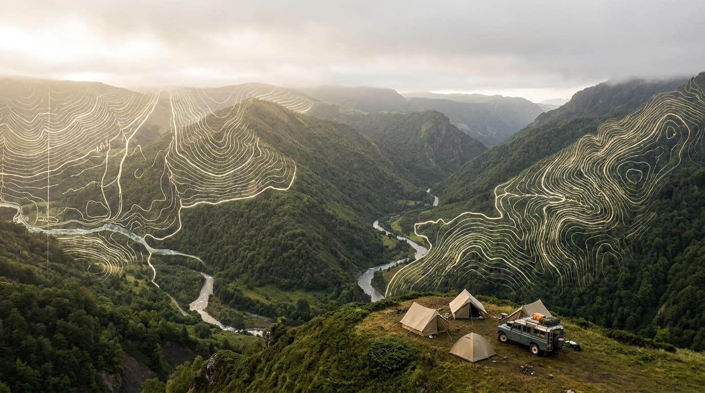
The concept
Meridian designs and sells small-group expeditions — twelve a year, twelve guests each — to remote, hard-to-reach places, sold as an immersive cartographic web experience. Each expedition is a scroll-driven map story: the route, the elevation, the days, the people. Booking happens inside the journey. Revenue: high-margin trip fees plus a members' waitlist with priority access to sold-out departures.
Who it’s for
Affluent, curious travellers who value rarity and story over resorts and checklists.
- 12×12
- Departures × guests
- Once
- Each route runs a single time
- Waitlist
- Members-first demand engine
Brand direction
Explorer-society cartography. Deep forest and topographic-line motifs, cream paper overlays, an expedition-club serif and a burnt-orange accent like a route drawn on a map. The site behaves like an interactive atlas — you trace each route across terrain as you scroll. It feels like a leather field journal turned into a website.
Visual identity
Deep Forest
#0d1512
Canvas
Route Orange
#d98a3d
Accent
Moss
#5f8f6e
Secondary
Parchment
#eee7d6
Type
Display type
Meridian
Zodiak — expedition-club serif
Text + system
General Sans — itinerary and booking UI
Coordinates and elevations set in mono; the route accent traces across the page as you scroll each journey.
Voice
A seasoned expedition leader: understated, precise about terrain and risk, romantic about the place.
REF · Cartographic expedition editorial — topographic lines, deep green + cream, explorer-society type; Kinfolk × National Geographic.
Homepage & product interface
Screen 01 · Expedition map storyKey product screen
Screen 02 · Expedition atlasMarketing angle
Rarity is the product: 'twelve guests, once a year' sells the opposite of mass tourism. The interactive map story does the emotional selling that a listings page can't.
The campaign
"The Edges of the Map" — a slow-media launch: each expedition released as a cinematic map story and a printed field-note booklet for members. Field films of past departures drive a members' waitlist; scarcity (single departures, 12 seats) does the converting.
Headline directions
“Twelve seats. One departure. Then it's a story you missed.”
“Trace the route before you take it.”
“The edges of the map are still bookable.”
What Limited Labs built
- 01Cartographic brand identity and expedition-club art direction
- 02Interactive, scroll-driven map-story web experience
- 03In-journey booking with single-departure scarcity
- 04Members' waitlist and printed field-note format
- 05'The Edges of the Map' slow-media launch campaign
Service demonstrated
Product Lab
Interactive storytelling & experience design — a narrative, map-driven web experience where the journey itself is the interface and rarity is the conversion mechanic.
Explore this serviceWork 24 of 25
Want a system like this for your business?
Every work in this collection is one connected build — brand, product, and marketing designed together. That’s the whole idea behind Limited Labs.