Brand identity · Agency · 2026
Studio Kin
A studio that designs like it means it.
- Brand identity
- Art direction
- Web design
The concept
Studio Kin is the self-brand of a fictional creative studio — the meta-work that proves Limited Labs can build a design house's own identity and site. It's a brand-and-web system for a studio that positions itself between advertising wit and Swiss rigor: big type, hard grids, one red. The site is the pitch, the portfolio and the personality in one. Revenue (for the studio): retainer and project design work.
Who it’s for
Ambitious founders and marketing leads shopping for a design partner with a point of view.
- 1 idea
- Per brand, with a spine
- 9/yr
- Focused studio model
- Memorable
- The only brief that matters
Brand direction
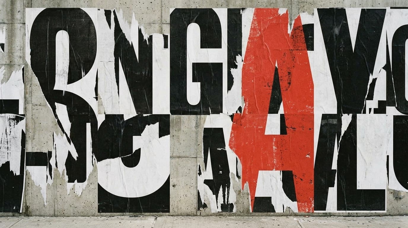
Swiss-brutalist confidence. Near-white paper, hard black type at enormous scale, one alarm-red accent, and a rigid grid with zero rounded corners. It borrows the poster tradition — type as image — and the attitude of a studio that has opinions. The wordmark is the whole system; everything else is scale and spacing.
Visual identity
Paper
#f2f2ef
Canvas
Alarm Red
#e4231b
Accent
Ink
#111111
Type
Slate
#6a6a66
Secondary
Display type
Studio Kin
Syne — expressive display grotesk, set huge
Text + system
General Sans — quiet body against loud headlines
Headlines run edge-to-edge and uppercase; red is used once per view, like a single spot color on a press.
Voice
A studio with a mouth: confident, a little cheeky, allergic to corporate mush.
REF · Swiss-brutalist type — black/white, one red, oversized grotesk, print-poster energy; Pentagram × Gretel.
Homepage & product interface
Screen 01 · Studio site / manifestoCampaign system
Screen 02 · Identity system in useMarketing angle
The brand is the proof: a design studio that can't brand itself can't brand you. Studio Kin's own identity does all the selling — confidence as the pitch.
The campaign
"Draw It From Memory" — a provocation campaign: Kin publishes a weekly teardown of a famous brand redesigned to be more memorable, plus a challenge asking founders to sketch their own logo from memory (most can't). The lesson always routes to Kin's method.
Headline directions
“If it needs a caption, it isn't working.”
“We do nine brands a year. Yours could be one.”
“Most brands are wallpaper. Let's not.”
What Limited Labs built
- 01Complete studio identity: wordmark, type system, one-red color rule
- 02Brutalist portfolio-and-manifesto website
- 03Poster/social/signage system from a single grid
- 04Studio positioning, voice and pitch narrative
- 05'Draw It From Memory' thought-leadership campaign
Service demonstrated
Brand
Brand identity systems — a pure identity-and-art-direction showcase proving Limited Labs can build a design-house-grade brand with a genuine point of view.
Explore this serviceWork 18 of 25
Want a system like this for your business?
Every work in this collection is one connected build — brand, product, and marketing designed together. That’s the whole idea behind Limited Labs.